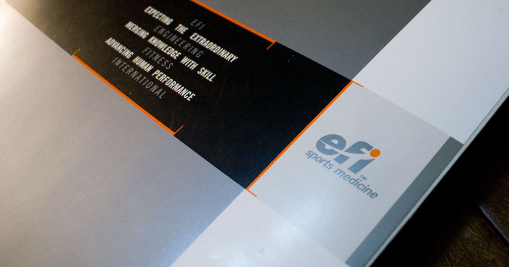
ENGINEERING FITNESS INTERNATIONAL

Trademark


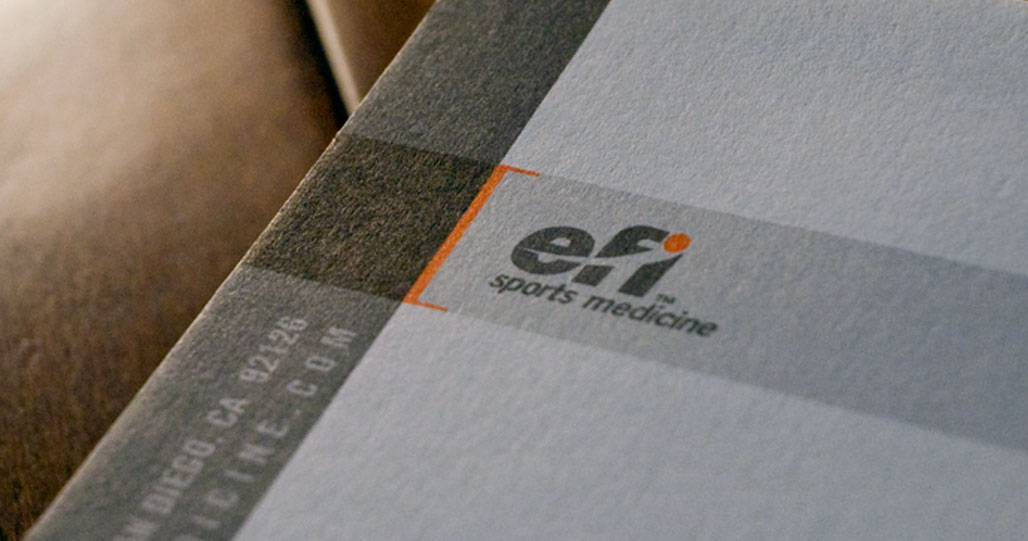
The identity for efi Sports Medicine has been designed to reflect the company’s dedication to provide its customers with quality, gravity-based exercise equipment and related services. The dynamic italic font of the efi logotype is accentuated by the forward sweeping motion of the dot capping the lowercase “i.” The logotype was designed to create an impression of full range motion, movement with and against gravity and foresight into the future all encapsulated into one dynamic mark.


ROLE:

  • • Art Direction
  • • Design


MORE IDENTITY WORK:


Untitled Document

ABOUT ME

I am an art director, web designer & filmmaker originally from Los Angeles, CA, now residing in Chula Vista Ca. Working on brand strategy and corporate identity are passions of mine. I beleive that every company has a personality and that properly crafting its presence in the marketplace can increase a company's profitability.


Specialties:

Creating thoughtful and effective graphic communication tools. Collaboration. Team-building. Results-driven design. Print Collateral, Web Development, Video production and editing.

DISTINCTIONS

2013 | Olympian High School Leadership Award
2009 | Davey Award
2008 | Communicator Award (3)
2007 | American G D Award (2)
2006 | Davey Award
2005 | efi Outstanding Achievement
2005 | Davey Award (3)
2005 | American In-house Design
2005 | American G D Award (3)
2004 | American G D Award (2)
2004 | The Creative Show - Silver
2003 | efi Outstanding Achievement
2003 | Telly Award
2002 | efi Leadership Award

CONTACT